




Ask the AI Tutor
Need help with Pictorial Representation of Data (F)? Ask our AI Tutor!
AI Tutor - Lucy
Connecting with Tutor...
Please wait while we establish connection
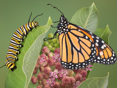
How many caterpillars are in this quiz?
Pictorial Representation of Data (F)
Read and draw data displays: bar charts, line graphs, and pie charts. Convert frequencies to angles, choose appropriate scales, and label clearly for GCSE Foundation success.
Question 1
/Q1c.PNG)
/Q1a1c.PNG)
/Q1a2c.PNG)
/Q1a3c.PNG)
/Q1a4c.PNG)
/Q1hcc.PNG)
Question 2
/Q2c.PNG)
/Q2a1c.PNG)
/Q2a2c.PNG)
/Q2a3c.PNG)
/Q2a4c.PNG)
/Q2hcx.PNG)
Question 3
/Q3c.PNG)
/Q3a1c.PNG)
/Q3a2c.PNG)
/Q3a3c.PNG)
/Q3a4c.PNG)
/Q3hcc.PNG)
Question 4
/Q4c.PNG)
/Q4a1c.PNG)
/Q4a2c.PNG)
/Q4a3c.PNG)
/Q4a4c.PNG)
/Q4hcc.PNG)
Question 5
/Q5c.PNG)
/Q5a1c.PNG)
/Q5a2x.PNG)
/Q5a3c.PNG)
/Q5a4c.PNG)
/Q5hcc.PNG)
Question 6
/Q6c.PNG)
/Q6a1c.PNG)
/Q6a2c.PNG)
/Q6a3c.PNG)
/Q6a4c.PNG)
/Q6hcc.PNG)
Question 7
/Q7c.PNG)
/Q7a1c.PNG)
/Q7a2c.PNG)
/Q7a3c.PNG)
/Q7a4c.PNG)
/Q7hcx.PNG)
Question 8
/Q8c.PNG)
/Q8a1c.PNG)
/Q8a2c.PNG)
/Q8a3c.PNG)
/Q8a4c.PNG)
/Q8hcx.PNG)
Question 9
/Q9c.PNG)
/Q9a1c.PNG)
/Q9a2c.PNG)
/Q9a3c.PNG)
/Q9a4c.PNG)
/Q9hcc.PNG)
Question 10
/Q10c.PNG)
/Q10a1c.PNG)
/Q10a2c.PNG)
/Q10a3c.PNG)
/Q10a4c.PNG)
/Q10hcc.PNG)



**Unlimited Quizzes Await You! 🚀**
Hey there, quiz champ! 🌟 You've already tackled today's free questions.
Ready for more?
Ready for more?
🔓 Unlock UNLIMITED Quizzes and challenge yourself every day. But that's
not all...
not all...
🔥 As a Subscriber you can join our thrilling "Daily Streak" against other
quizzers. Try to win a coveted spot on our Hall of Fame Page.
quizzers. Try to win a coveted spot on our Hall of Fame Page.
Don't miss out! Join us now and keep the fun rolling. 🎉
**Unlimited Quizzes Await You! 🚀**
Hey there, quiz champ! 🌟 You've already tackled today's free questions. Ready for more?
🔓 Unlock UNLIMITED Quizzes and challenge yourself every day. But that's not all...
🔥 As a Subscriber you can join our thrilling "Daily Streak" against other quizzers. Try to win a coveted spot on our Hall of Fame Page.
Don't miss out! Join us now and keep the fun rolling. 🎉




© Copyright 2016-2026 - Education Quizzes
Work Innovate Ltd - Design | Development |
Marketing
