Banner Images
Banners, Headers and Heroes
The main image at the top of a web page is known as the “Banner Image”, “Header Image” or “Hero Image” - whatever you call it, ours changes all the time!
You will see below the images we have used recently. For insights into how and why we design the top of our pages the way we do read more below.
1 - 8 Nov 2020

25 Oct – 1 Nov 2020

18 – 25 Oct 2020
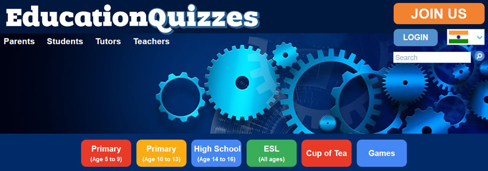
11 – 18 Oct 2020
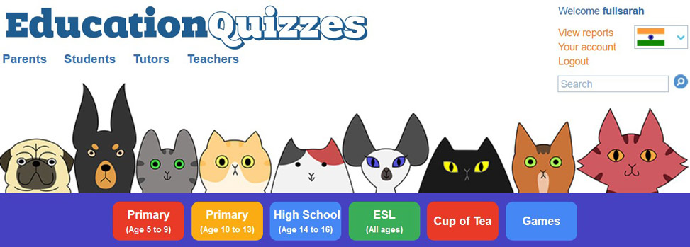
13 Sep – 11 Oct 2020
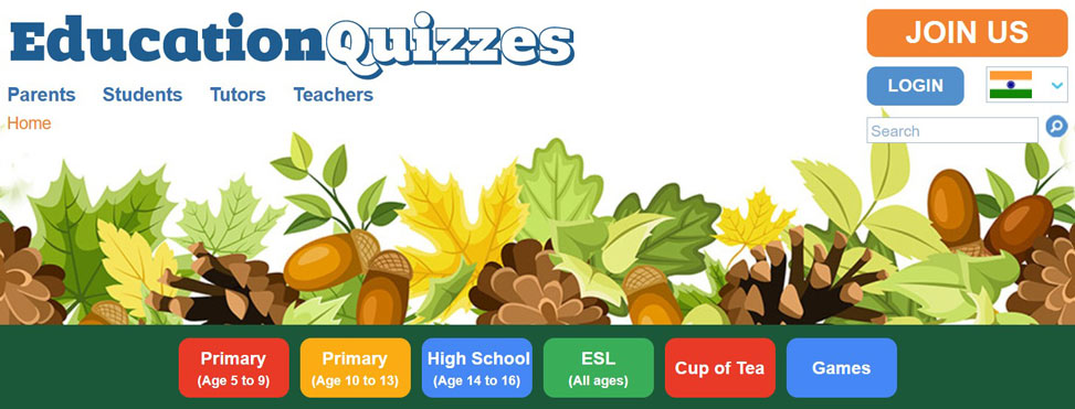
6 – 13 Sep 2020
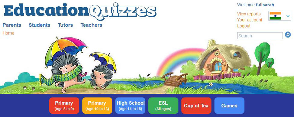
30 Aug – 6 Sep 2020
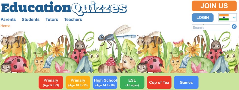
23 – 30 Aug 2020
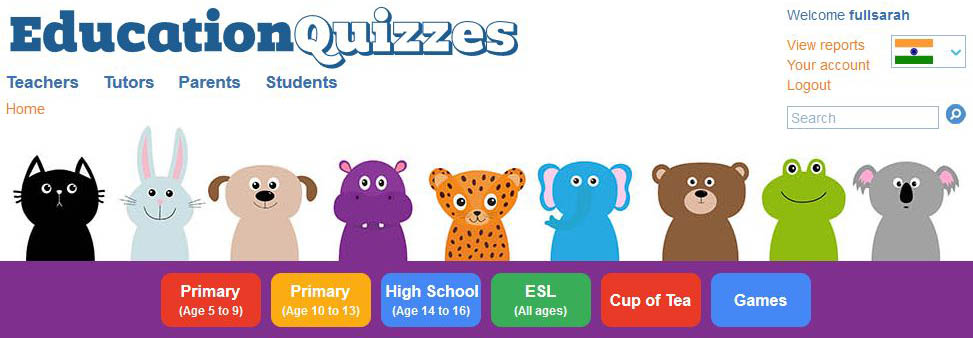
16 – 23 Aug 2020
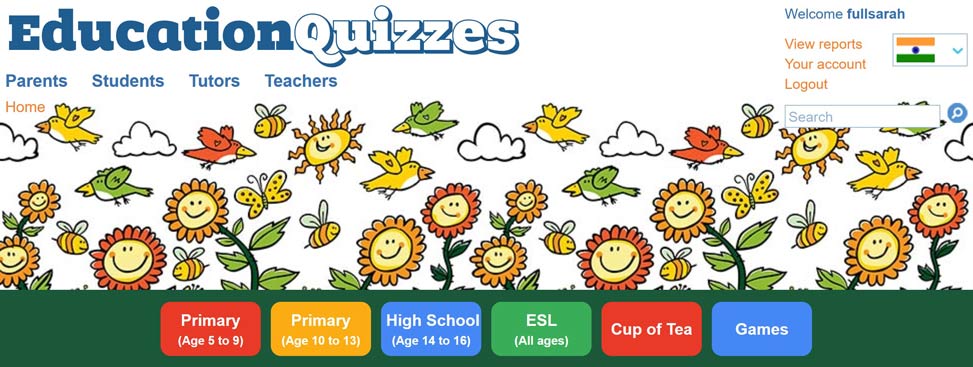
9 – 16 Aug 2020
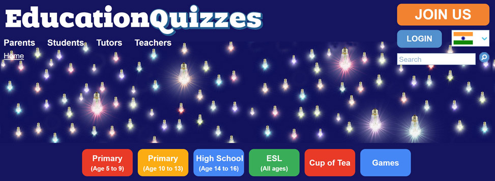
2 – 9 Aug 2020

26 July – 2 Aug 2020

19 to 26 July 2020
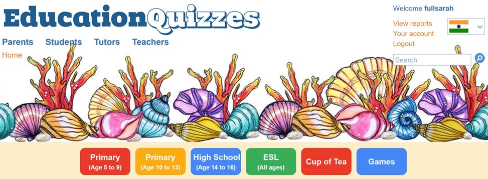
12 to 19 July 2020
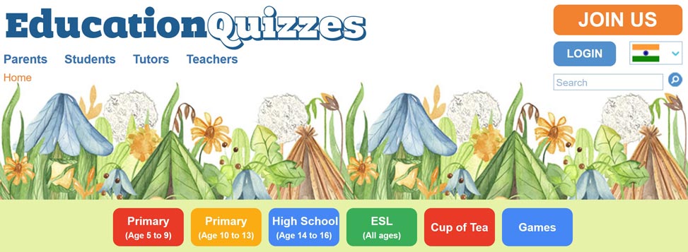
5 to 12 July 2020
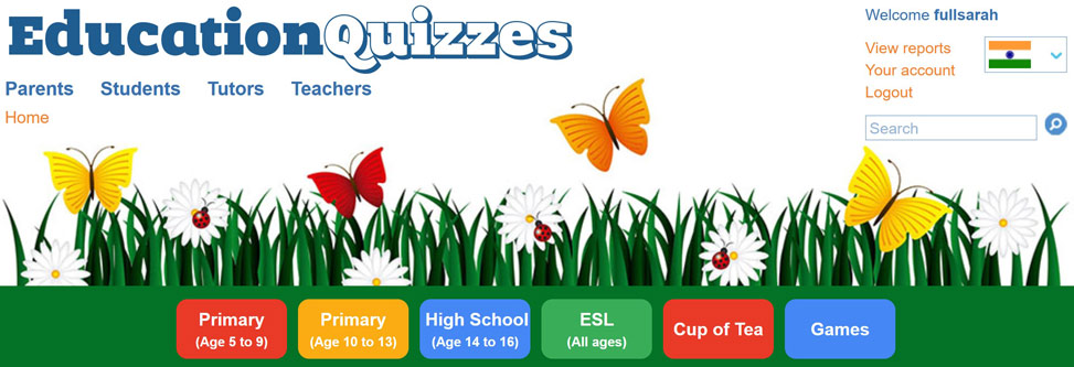
28 June to 5 July 2020

21 to 28 June 2020
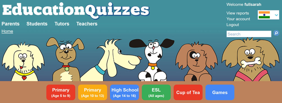
14 to 21 June 2020
17 May to 14 June 2020
10 to 17 May 2020
3 to 10 May 2020
26 April to 3 May 2020
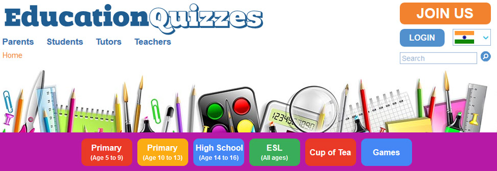
19 to 26 April 2020

12 to 19 April 2020
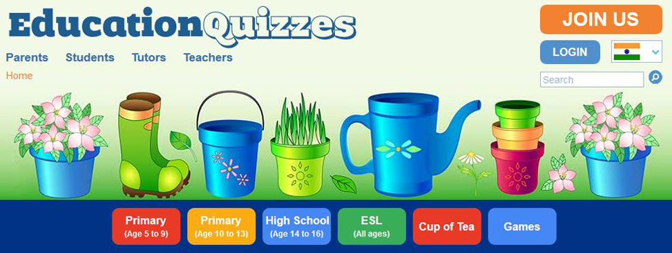
5 to 12 April 2020
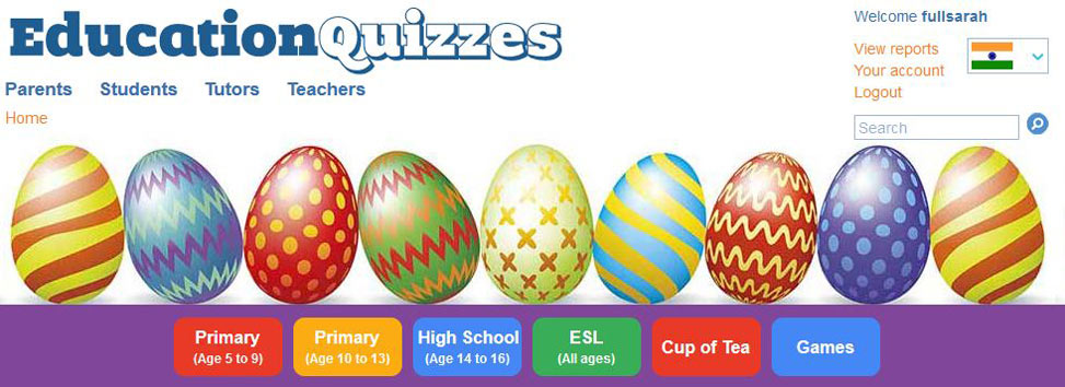
29 March to 5 April 2020
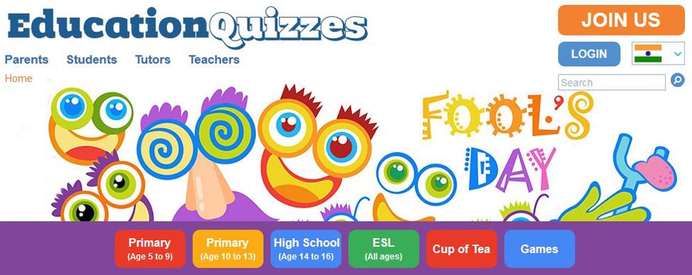
22 to 29 March 2020
15 to 22 March 2020
8 to 15 March 2020

1 to 8 March 2020
23 February to 1 March 2020

16 to 23 February 2020
9 to 16 February 2020
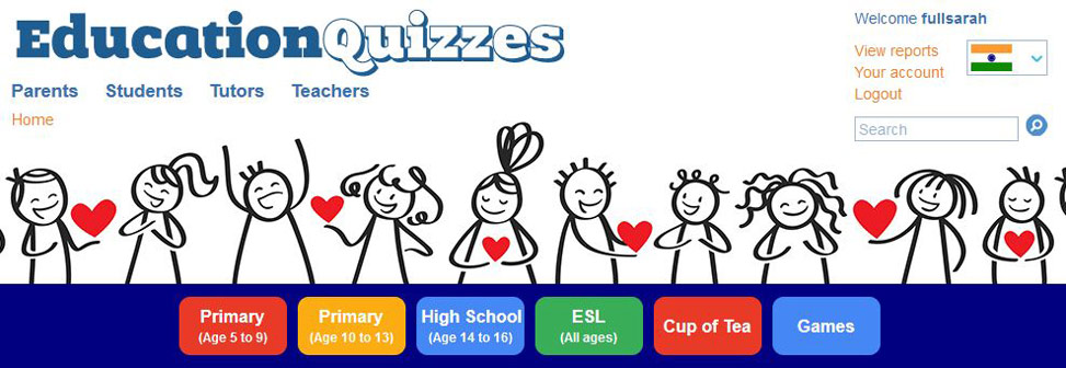
2 to 9 February 2020
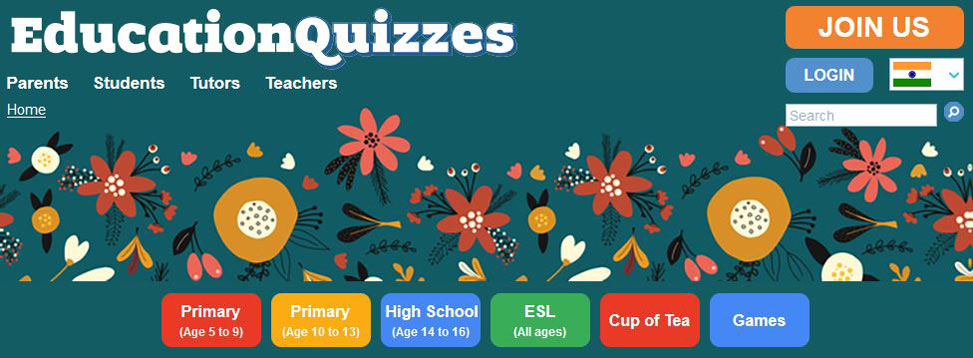
26 January to 2 February 2020

19 to 26 January 2020
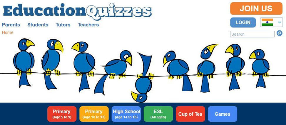
5 to 12 January 2020
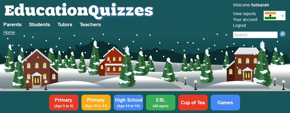
5 to 12 January 2020

27 December 2019 to 5 January 2020
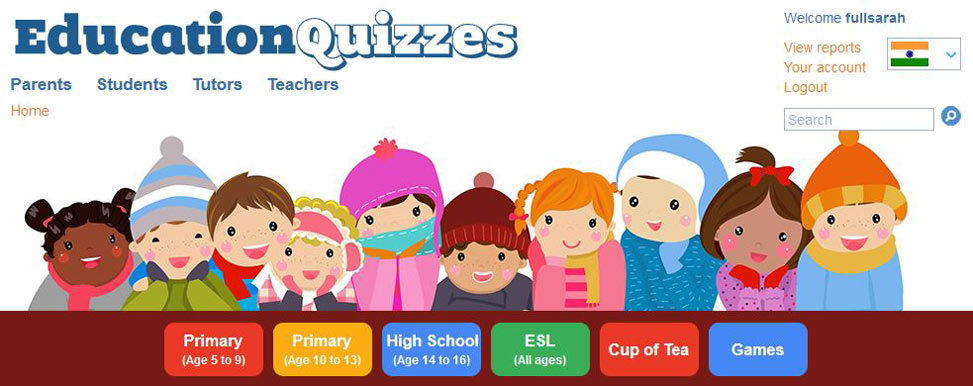
13 to 27 December 2019
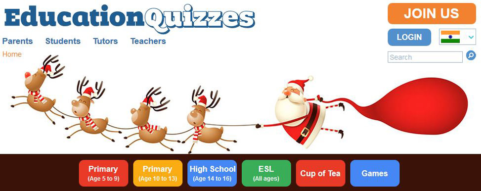
6 to 13 December 2019
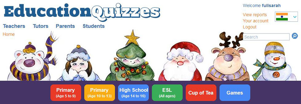
29 November to 6 December 2019
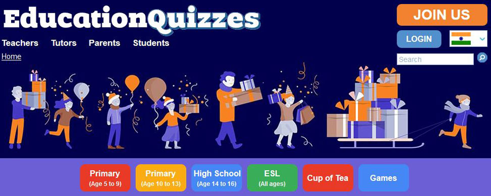
24 to 29 November 2019
19 to 24 November 2019
10 to 19 November 2019

1 to 10 November 2019
23 October to 1 November 2019

15 to 23 October 2019
8 to 15 October 2019
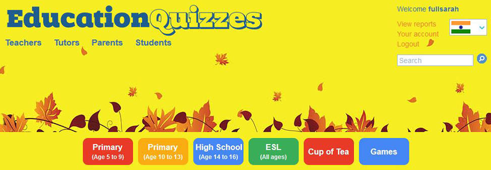
1 to 8 October 2019
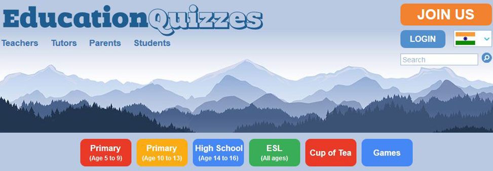
24 September to 1 October 2019
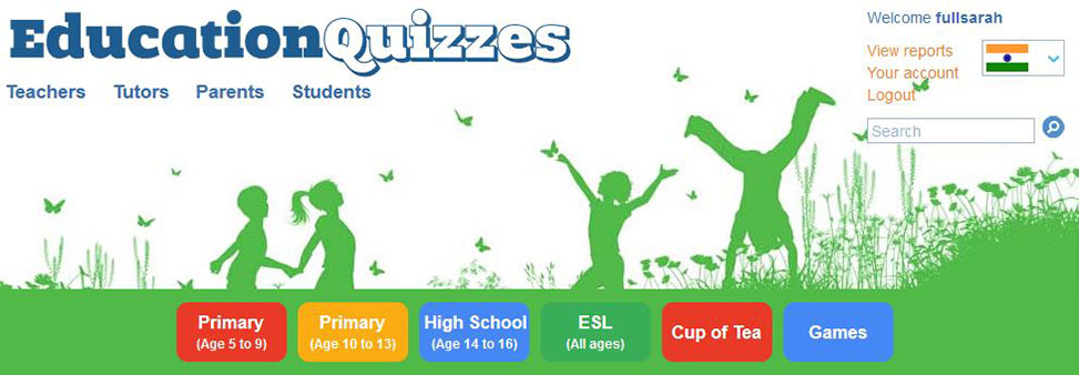
The Problem with Designers
During the past 8 years we have employed many different designers to reconfigure our website but the problem is that every one of them has had different ideas about what looks good and bad, what works and what doesn’t. The result is that we have tried any number of different designs with very mixed results.
With our current design we have taken what we consider to be the best ideas from our myriad designers and added some ideas of our own. What follows are details of our thought processes to get to where we are.
Trouble at the Top
We know that a visitor to a website makes up his/her mind about whether to stay or go within a few seconds. Inevitably the first thing that the visitor sees is the top of the page so it follows that this is the most important area to concentrate on. If our visitor doesn’t like what’s there then we’ve blown it, perhaps we will never see that person again.
So, what is it that makes someone stay and delve a little deeper into what we have to offer? We believe there are two extremely important elements:
- Navigation links that are as helpful as possible to the visitor
- A picture that endears us to the visitor and makes them want to learn about us
So far so good but what navigation links and what pictures do we use? Navigation links are a science whilst choosing a picture is an art so let’s look at each in turn.
Navigation Links
We are very objective about the links we choose to display at the top of our site. We use Google Analytics to tell us which pages are the most visited and the routes that people have chosen to get to them. Then, we do everything we can to simplify the journey so that people find what they want as easily and quickly as possible – all with a little help from Google!
It is tempting to try and manipulate the journey so that we get our sales messages across but experience has taught us that is very unwise because:
Visitors who get lost quickly leave us.
Visitors who get frustrated quickly leave us.
For these reasons our overriding objective is to help people ENJOY our website. That’s not to say that we don’t want them to come on board as subscribers. If we are the right fit for our visitor then they might want to join us and for that reason we have a “Join Us” button at the top of every page.
In our case, visitors might want to know what we can offer for their “Category” of person so we give them a row of links like this:
On the other hand they might be looking for help with a specific curriculum so we give them another row of links that looks like this:
The top of EVERY page on our site ALWAYS carries the same links. That way our site visitors quickly get “comfortable” with the site - they can navigate from “Primary” to “Games” to “High School” to “Parents” with the greatest of ease. The top of every page also has a breadcrumb trail so that visitors are never lost
We don’t pussy-foot around with endlessly changing fonts! Words are for reading and the easier that is, the more our customers will appreciate it.
That is the easy part, now we come to the “Art” part of the task – choosing pictures.
Using Pictures
Finding a hairstyle that pleases all your friends and family is a real challenge but finding a banner/header/hero image that meets with the approval of all our website visitors is a complete impossibility. We have now accepted that we can’t please all the people all the time and have decided instead to please all the people some of the time! That is one of the reasons we change our banner most weeks but there is another, equally important, reason…
Our lot in life is not an easy one – it’s not always riveting for children to learn about adjectives, BODMAS and electrical circuits! The least we can do for our students is to introduce an element of surprise and excitement into their learning by featuring different images at the top of our pages.
If someone tells us they don’t like this week’s picture, we tell them not to worry because next week it will change. If someone says they love the picture we tell them that it is only there temporarily but we aim to make next week’s picture even better.
Corporate Identity
I can hear the marketing gurus screaming “But what about your corporate identity?” “How do you expect people to recognise you if you keep changing your website?” To which we reply that our Education Quizzes logo is always there, always big and always unmissable. If you look through the images above we’re sure you will agree that anyone looking at our website cannot fail to recognise who we are and what we do.
Choosing Pictures
Choosing the right pictures requires care and consideration but we figure that all our site visitors are worth a little time and trouble.
Many pictures just won’t work. Try as you might, you are never going to squeeze a portrait orientation into our landscape format. Having said that, we sometimes find that taking a horizontal slice from a larger picture sometimes works.
We spend an hour or two each week poring over the pictures in the Dreamstime library - somewhere amongst their 115 million stock images we can always find some inspiration!
Very often an image needs to be flipped and joined horizontally so that it fills even the widest screen but a basic knowledge of Photoshop will get you over this hurdle.
Is it Difficult to Constantly Change Images?
We have an excellent website developer who is understanding of our limited abilities! The developer has setup our CMS so that it makes it a doddle for us to frequently change the image. If you want to do the same thing on a website then here are a few tips to pass on to your developer:
* All the links remain constant and “sit on top” of the chosen image
* Our images are uploaded via our CMS into our image library
* Our images are always 2,916 pixels wide
* Within our CMS we can change the image height to accommodate the image
* Within our CMS we can change the font colour to “light” or “dark” so that it does not get lost when sitting over the image


